

The NZ mortality data (updated)
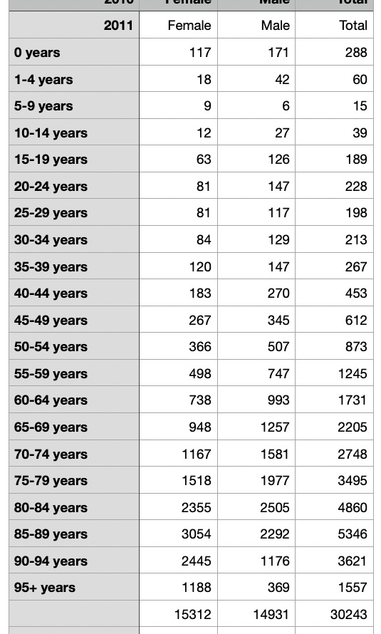
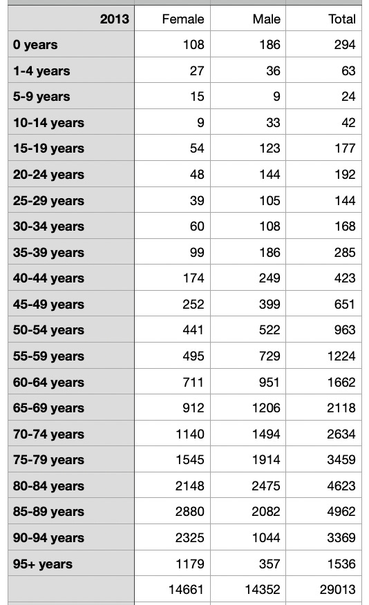
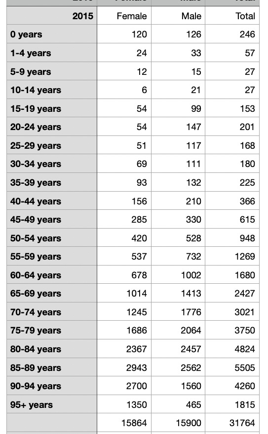
From 2010

I see some comments around the place with some people refuting Steve Kirsch’s claims to excess mortality in NZ of around 10k from the jabs. I think that this is an overestimate as well but it might not be. 2022 data by itself indicates excess mortality around 4-5k and maybe even more. No I havn’t put it into R, my data, like Steve’s, is just a basic spreadsheet at the moment. But I do know some R (which is a NZ program btw) so I might have a go at that as well. In the meantime here are the stats for the last 14 years. First of all let’s compare the first 9 months of 2022 and 2023. Remember that 2022 is well up on all previous years.
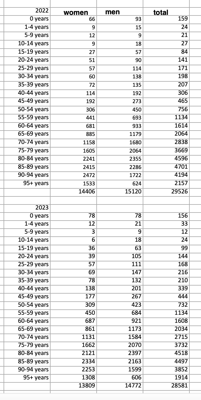
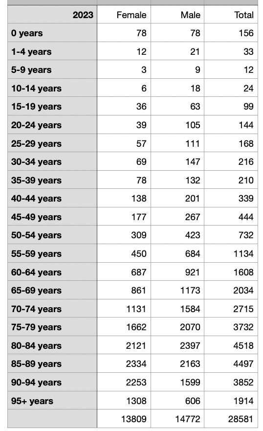
So 2023 deaths to September are down a little on 2022 deaths but not as much as they should be from data that we have from 2010 to 2020.
BTW nobody has put up the monthly data as far as I know, so that might be next. And sorry but it was quicker to add the column names in Graphic Converter than to go back to Numbers and do it (I hate Microsoft, and use either Numbers or neoOffice instead, yes I’m doing this on a Mac but there’s a Linux machine a few metres away and I’m more than au fait with it if anybody tries to press their IT prowess for advantage).
Here’s that spreadsheet in excel and pdf format.
Now let’s have a look at the full years data back to 2010 shall we? Here we go. This image only gives a preview of 2010 but I believe that if you click on it then it will give you all the years from 2010 to 2023 (2023 figures are only up to September 30th of that year).
2011 Registered deaths in New Zealand
2012 Registered deaths in New Zealand

2013 Registered deaths in New Zealand
2014 Registered deaths in New Zealand

2015 Registered deaths in New Zealand
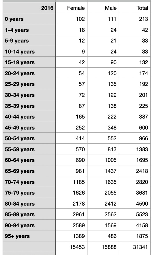
2016 Registered deaths in New Zealand
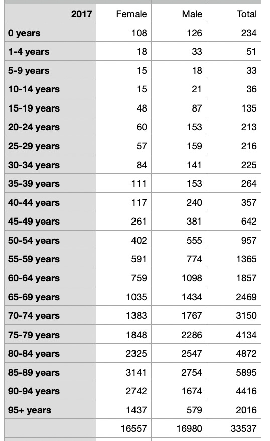
2017 Registered deaths in New Zealand
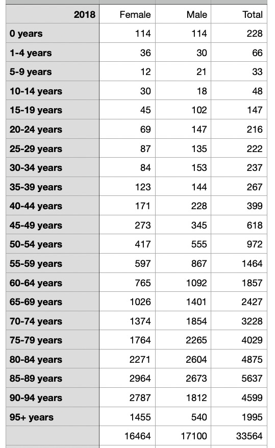
2018 Registered deaths in New Zealand
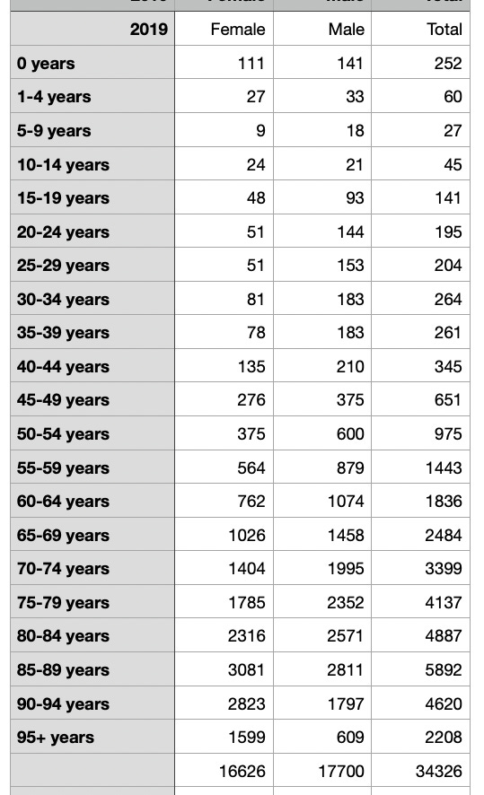
2019 Registered deaths in New Zealand
2020 Registered deaths in New Zealand
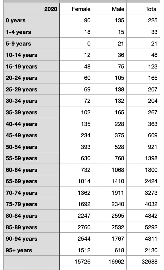
2021 Registered deaths in New Zealand
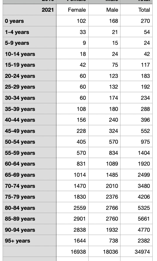
2022 Registered deaths in New Zealand
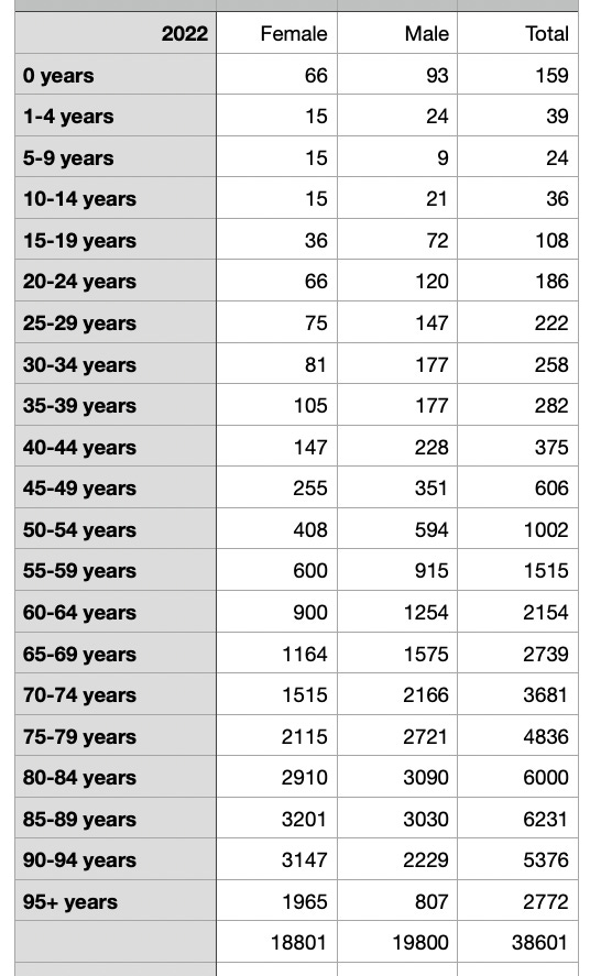
2023 Registered deaths in New Zealand
(not full year, Jan - Sep inclusive)
Here’s the pdf.
I don’t doubt that the NZ Government has set their trolls onto this one. Use the data however you like, it’s from NZ Stats originally but I have put it into the age groups for each year which is a little harder to find on their website. You could also filter by both month and (self declared) ethnicity.
This is somewhat interesting, the differences in age groups between 2022 and 2010. Basically in 2022 kids are more likely to live and the elderly are more likely to die than in 2010. Therefore the jabs seem to be hitting the elderly the hardest.
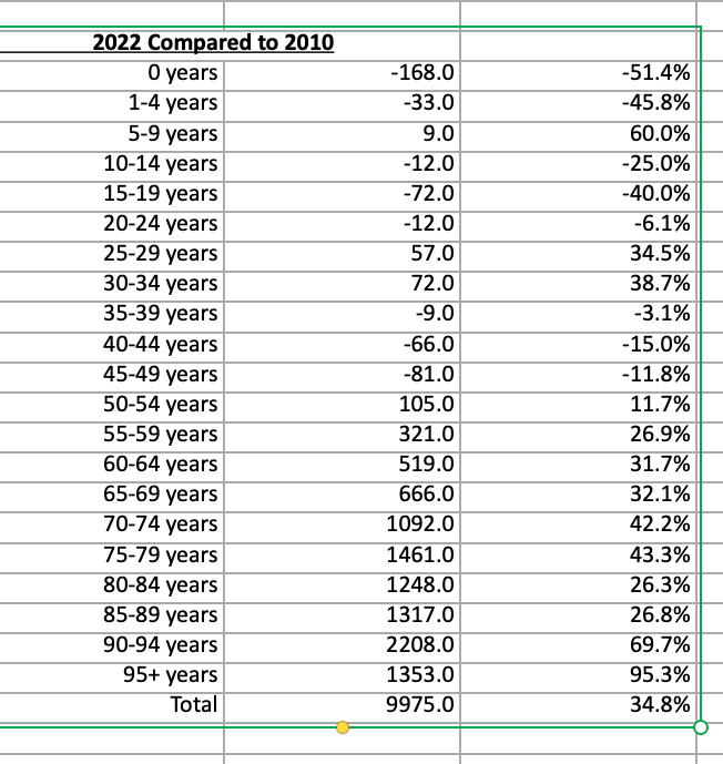
Why are fewer kids dying? Maybe because it’s more likely that one or more of their parents are at home with them? Just a suggestion…..
Here is my original spreadsheet with the raw data on it in Excel format. Apologies to any non Excel users out there but Substack doesn’t support CSV format. You should be able to open it regardless.
You are welcome to check my formulas. The notes are NZ Stats not mine.
Thanks for posting this data :)
Well, it looks like the experimental gene therapy Mod RNA "vaccines" worked after all! They've even cured death itself. ;-)